As a journalist that mainly works with broadcast, it can be challenging to communicate information without being able to directly link to other sources. To help combat this issue, I employ a variety of techniques to help visually convey information to the viewer while giving credibility to the sources I use. I have done this by teaching myself to design my own graphics using Premiere Pro, CapCut, After Effects, and Canva.
Because broadcast is a visual format, it can be difficult to link articles to statements that I am making. Using article titles as a visual graphic in the video helps to give context and provides an opportunity for viewers to research the topic more on their own.
Our journalism program aims for videos to be no longer than three minutes to keep viewer attention. Using text as a graphic allows me to show supporting evidence for statements that I make without having to read the quote word for word, which saves time, allows me to better explore the story I am covering, and gives the story credibility.
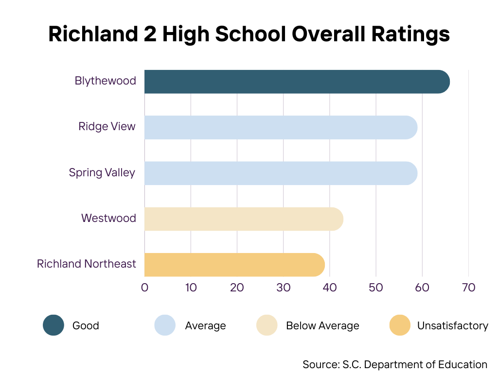
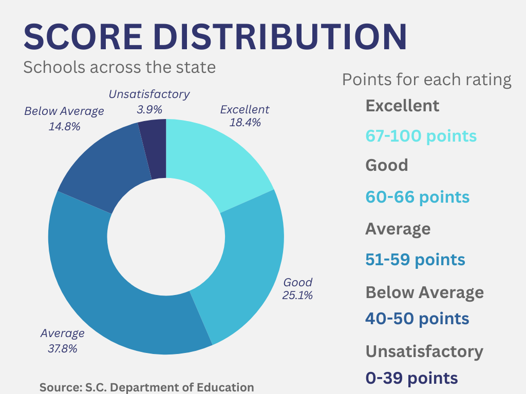
These infographics are charts or other visual aids that I use to help convey data or complicated ideas in videos. This allows me to talk about data while visually explaining it to the viewer. Each graphic is animated to help draw the viewer's interest, and I have experimented with different transitions and styles of graphics. I started out using CapCut and Procreate to make these graphics, and over time I progressed into using After Effects as I learned more about how to use the program.

These two infographics were used in a written story that I did on the school report card score for my school. These graphics helped to convey the score distributions both across the state of South Carolina and in the school district compared to Richland Northeast High School's rating. This helps the viewer to understand the differences between Northeast’s score and other schools, both in the district and across the state.
To help bring visual interest to stories and grab and keep viewer’s attention, I use shot sequencing and design to help emphasize what I am saying. Because broadcast journalism heavily relies on a visual element, it is important that what viewers see on the screen relates to what the audio is saying. Creating a visually coherent story with high-quality and relevant B-roll enhances the video and can help to connect viewers to the location, event, or issue.